Right-Sizing Your Data Story
10 SaaS board reporting ideas that meet the goldilocks rule of sharing nuance without offering so much minutia as to be ignored.

At our most recent On the Business mastery day earlier this month, I celebrated the ARR waterfall chart as one of my favorite SaaS board charts of all time, and later told the audience that as a data nerd, I could probably rattle off my top ten favorite board charts. Unsurprisingly, I received many requests to publish said list, which proved to be great inspiration for this month’s Tactic Talk!
Time series graphs for metrics such as ARR growth and net dollar retention are table stakes for board decks, so I’ve focused these suggestions on less obvious additions. These examples are just that—suggestions—and not intended to be an exhaustive checklist or template but rather inspiration for leveling up how to share richer context with board members.
1. Summarize growth with an ARR waterfall
The ARR waterfall is the simplest and most elegant way to explain the ARR additions and subtractions. This visualization is particularly helpful for breaking out ACV contraction vs. full logo churn.
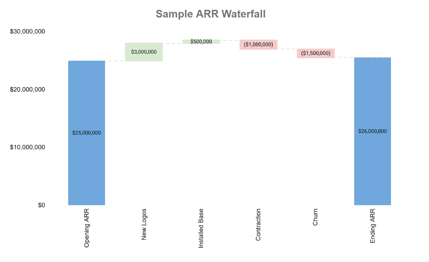
Contraction is frequently a silent killer of net retention rates; in the example above, 50% of the gross churn (the aggregate of logo churn + shrinking contracts) is contraction, not full-blown churn. I experienced a parallel reality during my tenure as CRO of Sailthru, and the root cause of our contraction issue ultimately proved to be a pricing problem: we were charging customers annual license fees based on their estimated annual email volume, and it turned out that customers were really bad at estimating! A modification to the pricing model paid dividends for reducing gross churn.
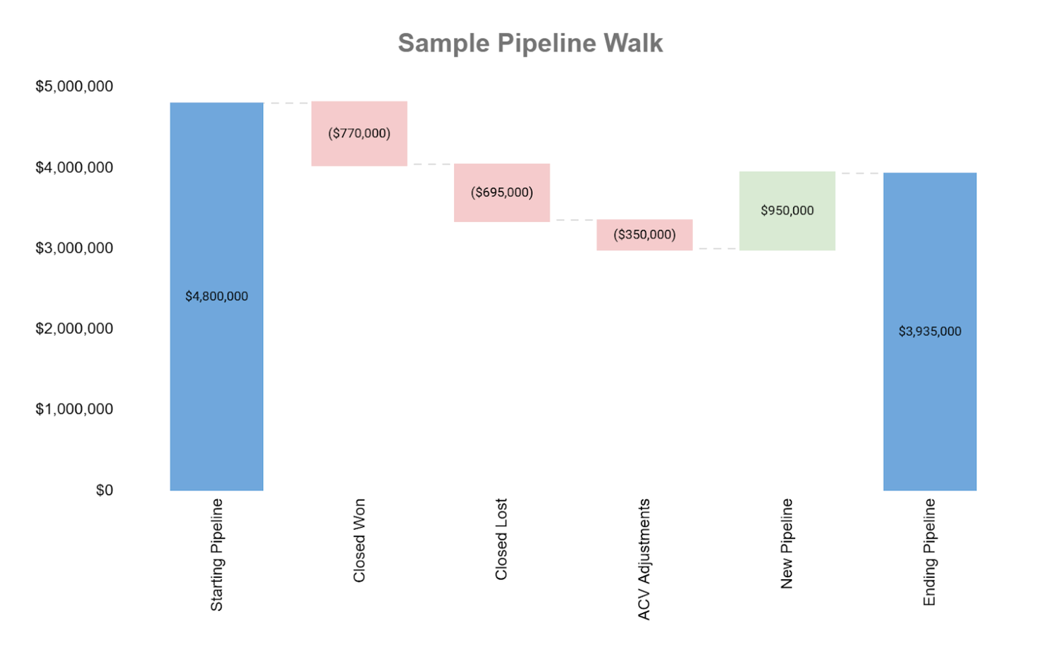
Editor’s note: waterfall charts are helpful visualizations for any “here’s what came in and went out”- type storytelling needs. The next example shows a waterfall view of pipeline dollars in a given period.
2. Outline progression on revenue per customer
I’ve said it before and I’ll say it over and over again: retention is always the cheapest form of growth. But best-in-class retention isn’t just about retaining logos, it’s also about growing existing contracts.
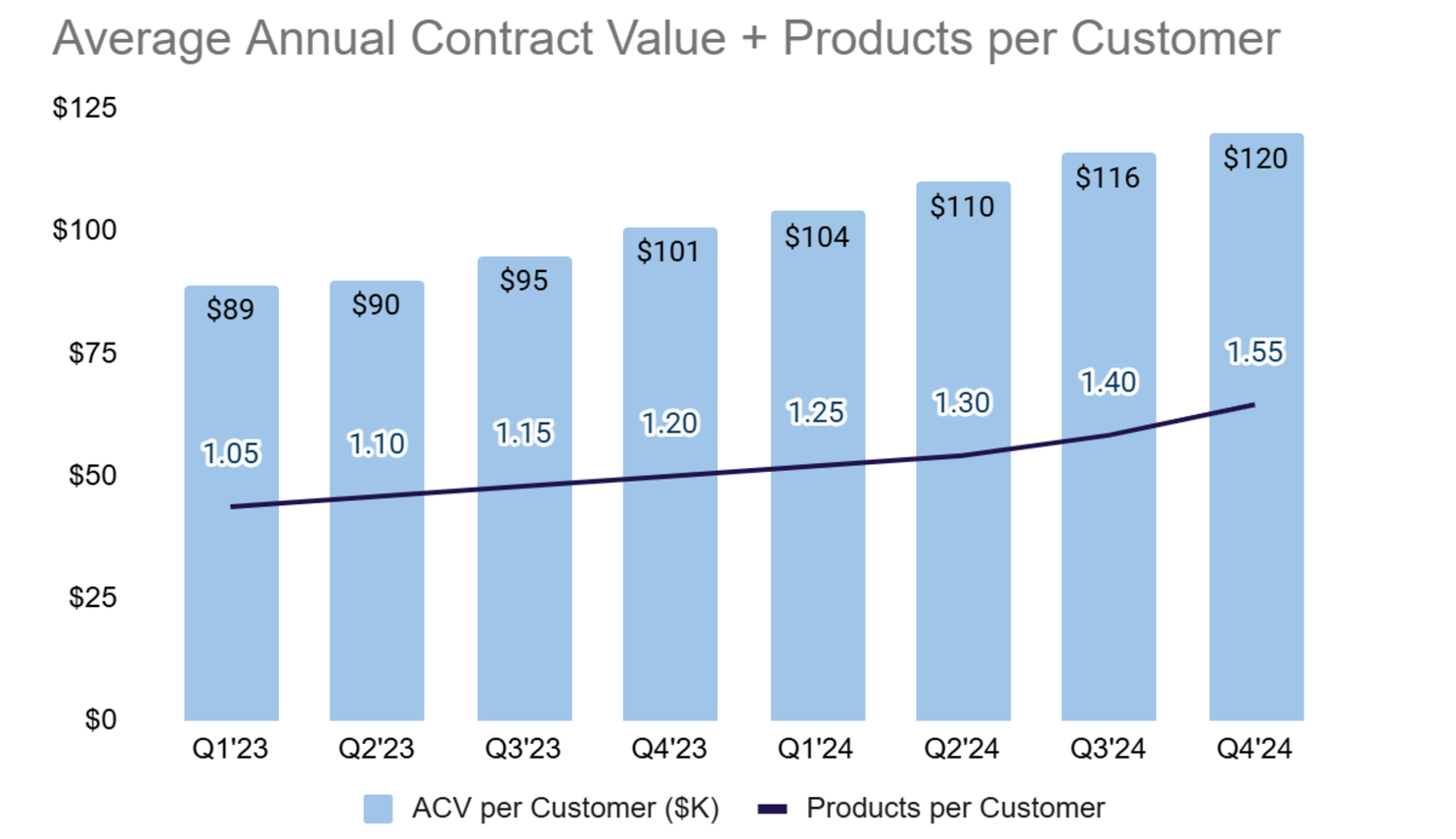
The chart above is a simple way to showcase the progression of average ACV per customer as well as average number of products per customer. In a business that has fewer products to cross-sell and instead drives expansion from selling additional use cases or business units, the products per customer metric could be tweaked to number of use cases per customer.
3. Use “APE” to summarize overall efficiency of the organization
In the summer of 2022 the team at Battery Ventures championed “APE”–ARR per employee–as the new North Star metric for SaaS companies. There is no right or wrong answer for your APE target; the name of the game is really just driving continuous improvement over time–and if you’re on the path to profitability, devising a target based on your breakeven APE.
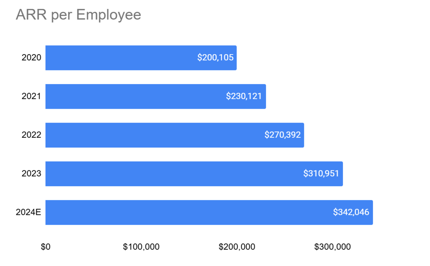
Editor’s note: Tomasz Tunguz from Theory Ventures published directional guidance on target YoY APE growth based on company stage, e.g. for companies 0-2 years into their lifecycle and largely focused on product development, there is little expectation for growth.
4. “Talk the walk” when discussing gross margin improvements
While we’re on the topic of efficiency, let’s talk about gross margin, a metric that is making its way to centerstage earlier and earlier in a company’s journey, especially given AI’s potential to radically shift the gross margin profile of any business.
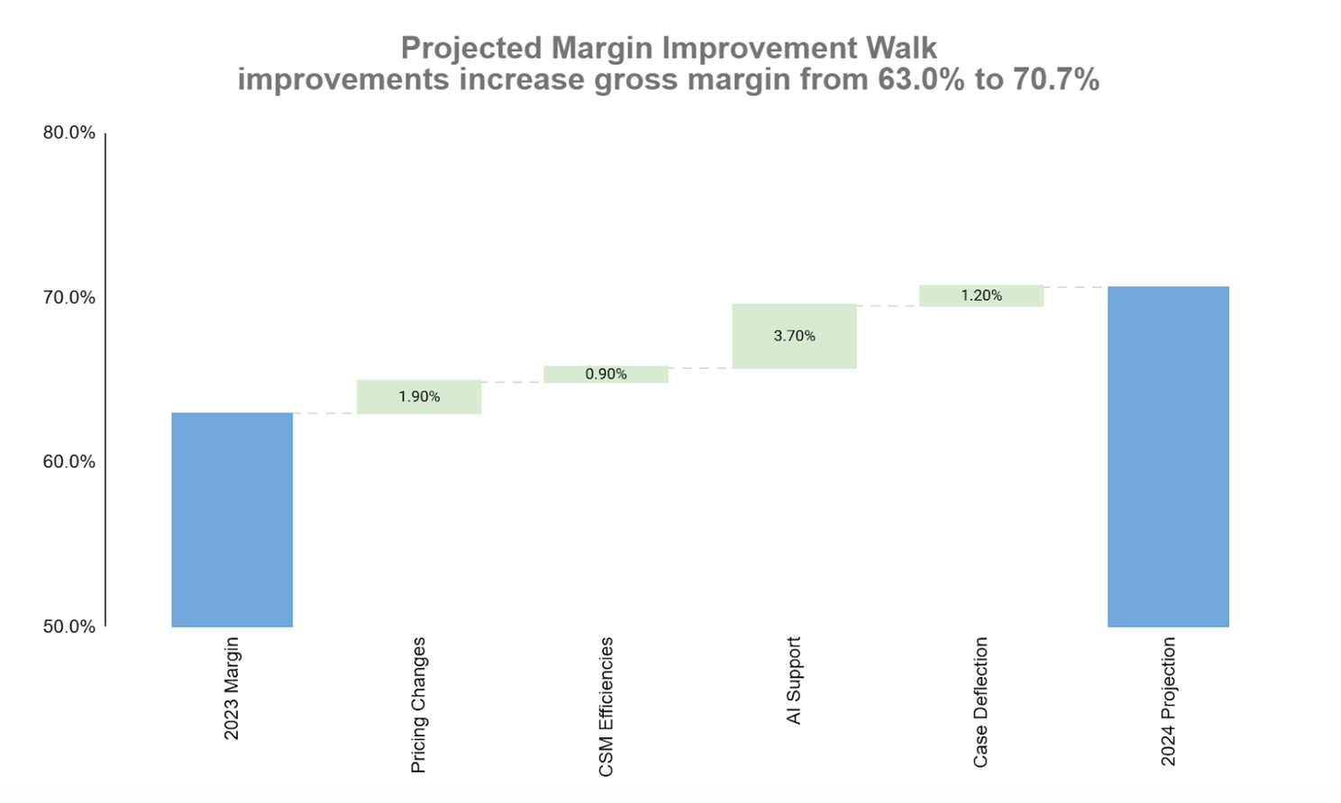
Perhaps unsurprisingly, I’ve turned to the waterfall chart as a powerful visualization to outline the “walk” behind an actual or planned improvement in gross margin. The chart above details a company’s plan to improve gross margin from 63% to 71% this year, with investments in AI support tools playing a material part in that plan.
5. Break out CS efficiency metrics into their own reports
SaaS board decks almost always cover sales and marketing efficiency metrics, but far too few of them regularly address the efficiency of the customer success team. CS efficiency definitions vary by CS sub-function (e.g. CSM team vs. technical support) and all are important. Today I’m outlining three metrics that can help tell a compelling story: 1) ARR per CSM, 2) tickets per $1MM ARR and 3) professional services billable utilization.
ARR per CSM
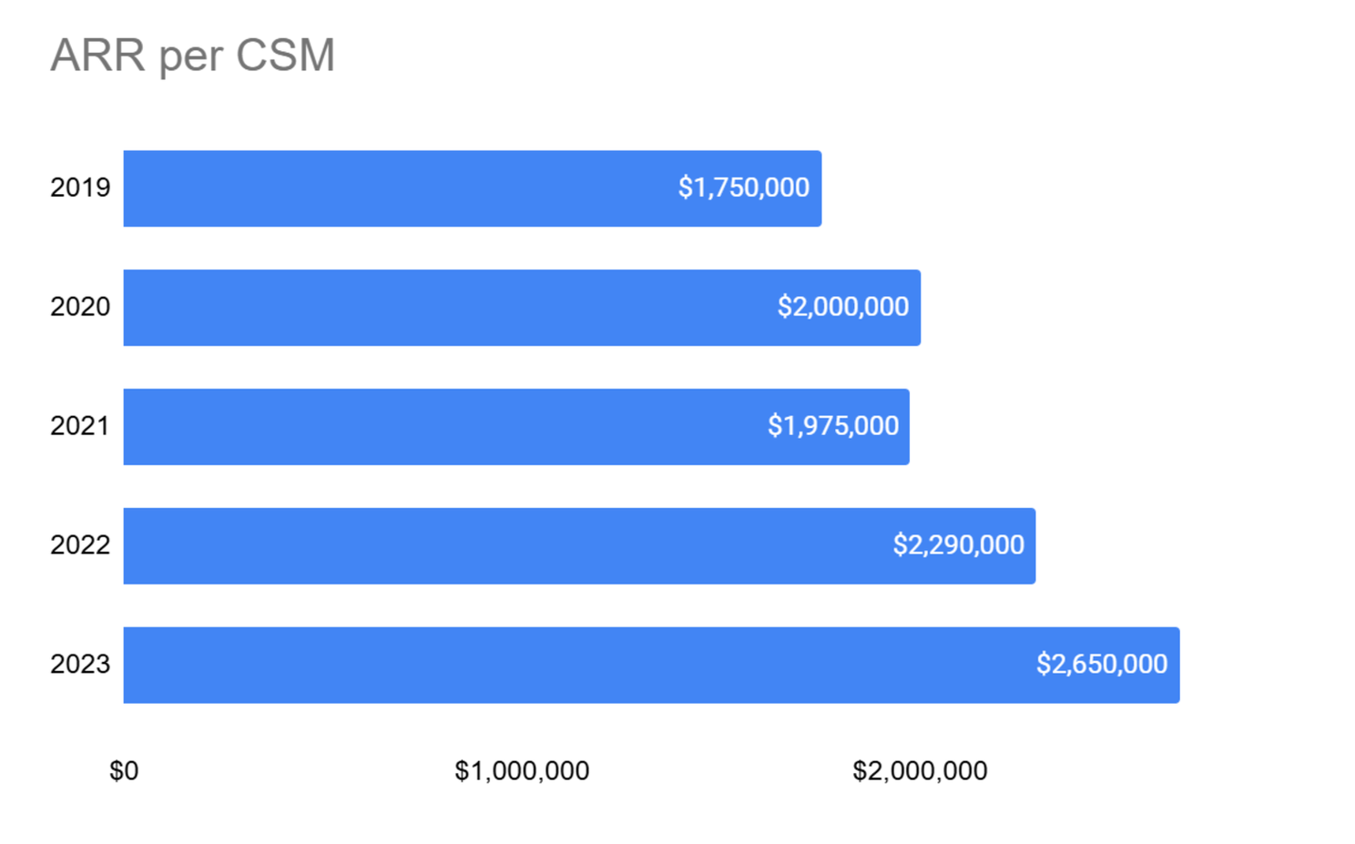
ARR load per CSM is a straightforward efficiency metric for the CSM team; as a company grows, they must find leverage that enables each CSM to manage a larger book of business.
Tickets per $1MM ARR
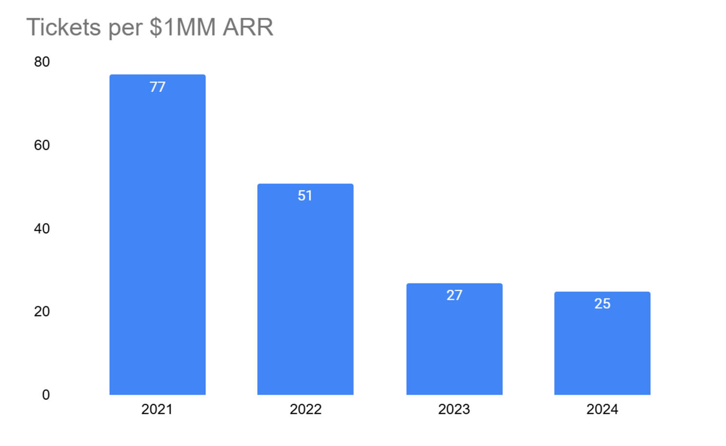
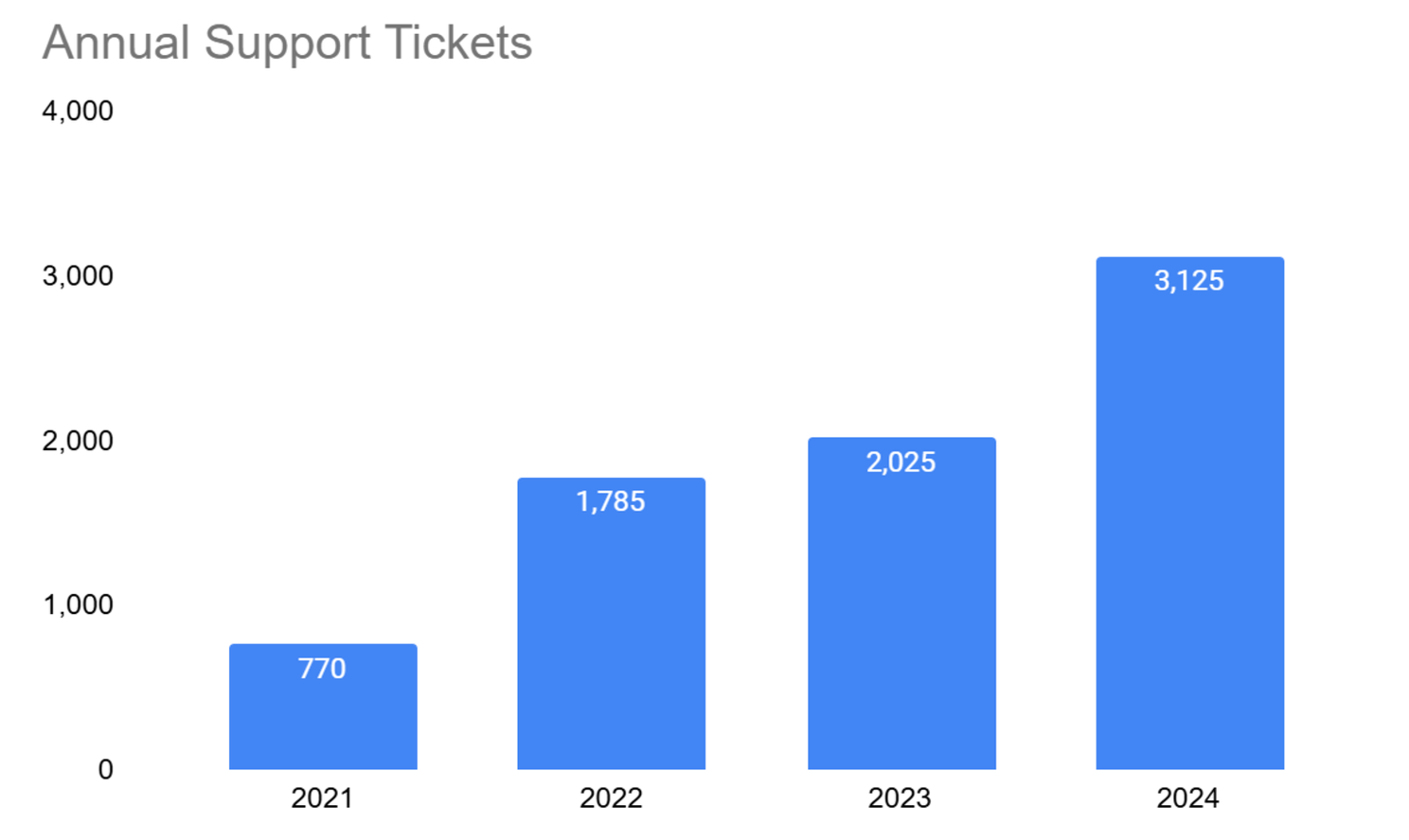
Support ticket volume will invariably increase as a business grows—at least until AI really unleashes its prowess, so examining the absolute value of support ticket volume isn’t particularly helpful. Normalizing ticket data vis-a-vis ARR is a simple approach to make volume analysis more actionable: ideally your ticket volume is growing more slowly than your top-line!
In the charts below, you’ll immediately notice that normalizing tickets per $1MM ARR (e.g. the company had 770 tickets vis-a-vis $10MM ARR in 2021 and then 3,125 tickets vis-a-vis $125MM ARR In 2024) tells a far different story than simply looking at ticket volume on its own.
Editor’s note: assessing tickets per $ ARR is one of many metrics to consider. Marketplace businesses regularly use a derivation such as tickets per 100 orders, etc.
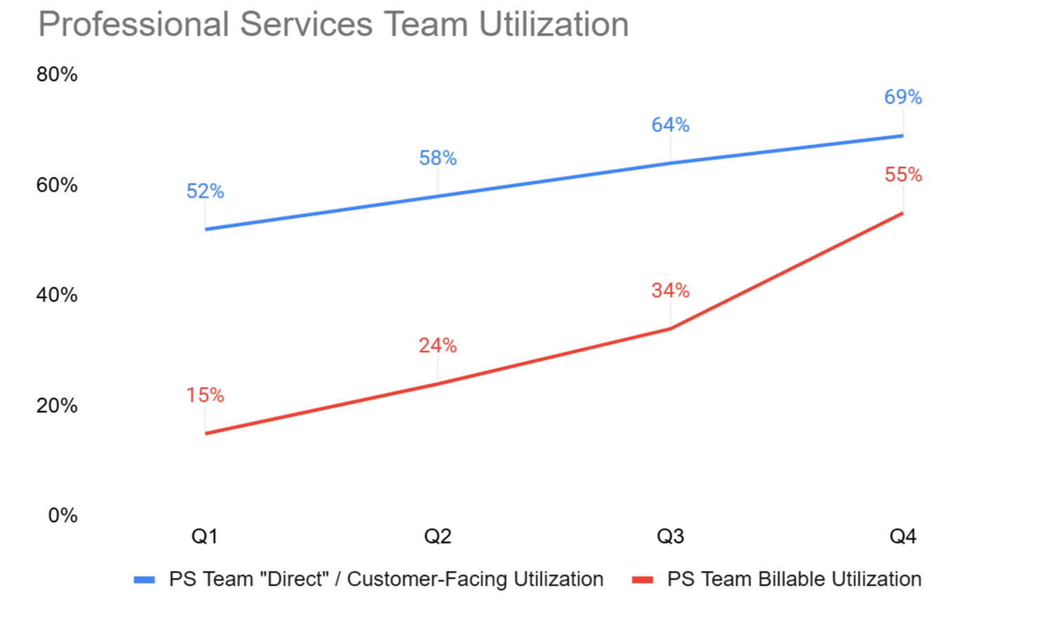
Professional Services Billable Utilization
As companies work to ensure their professional services functions are at least breaking even, all eyes need to be on utilization rates for that team. The chart below summarizes two different types of utilization 1) customer-facing time (blue line) and 2) billable utilization (red line), aka what portion of the team’s time could be billed to a customer.
6. Showcase command for pipeline coverage
Pipeline coverage is the lifeblood of every B2B organization. Sure, hitting the current quarter’s target is always a win, but the best commercial leaders obsess over the out months and quarters and proactively communicate how the future is shaping up.
The chart below is a simple visualization for pipeline coverage. Examining coverage at the quarterly level is for illustrative purposes only; higher velocity sales organizations will use a shorter time frame (e.g. by month).
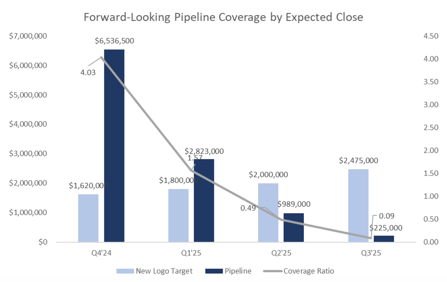
Every company needs a pipeline coverage requirement, and the most straightforward way to calculate that target is 1 ÷ win rate. If the company is closing 25% of qualified opportunities, they need 4x coverage; if they’re closing 50% of them, they only need 2x (and congratulations, because that’s fantastic!). Editor’s note: there’s of course nuance to that statement based on deal stage, etc. but understanding the full-funnel coverage requirement is an easy place to start.
In this example, if we assume Company X has a 25% win rate (requiring 4x coverage) and a six-month sales cycle, we immediately become concerned about Q1, where we only have 1.6x coverage today. Given the length of the sales cycle and the reality that we’re in late Q4, Q1’25 feels like a stretch. To de-risk the Q1 plan, Company X’s commercial leader should be thinking about 1) SPIFs to accelerate pipeline creation right now (so there is at least some degree of hope of generating opportunities that could close in Q1) and 2) closely examining commercial opportunities in the existing customer base knowing that the new logo target will likely be a miss.
7. Share progress on cash management and collection improvements
Cash runway is everything for startup companies, so this metric should be front and center in every board deck. The chart below is one used early on at Sailthru to walk investors through our monthly cash balance and overall runway (both with and without our loan facility).

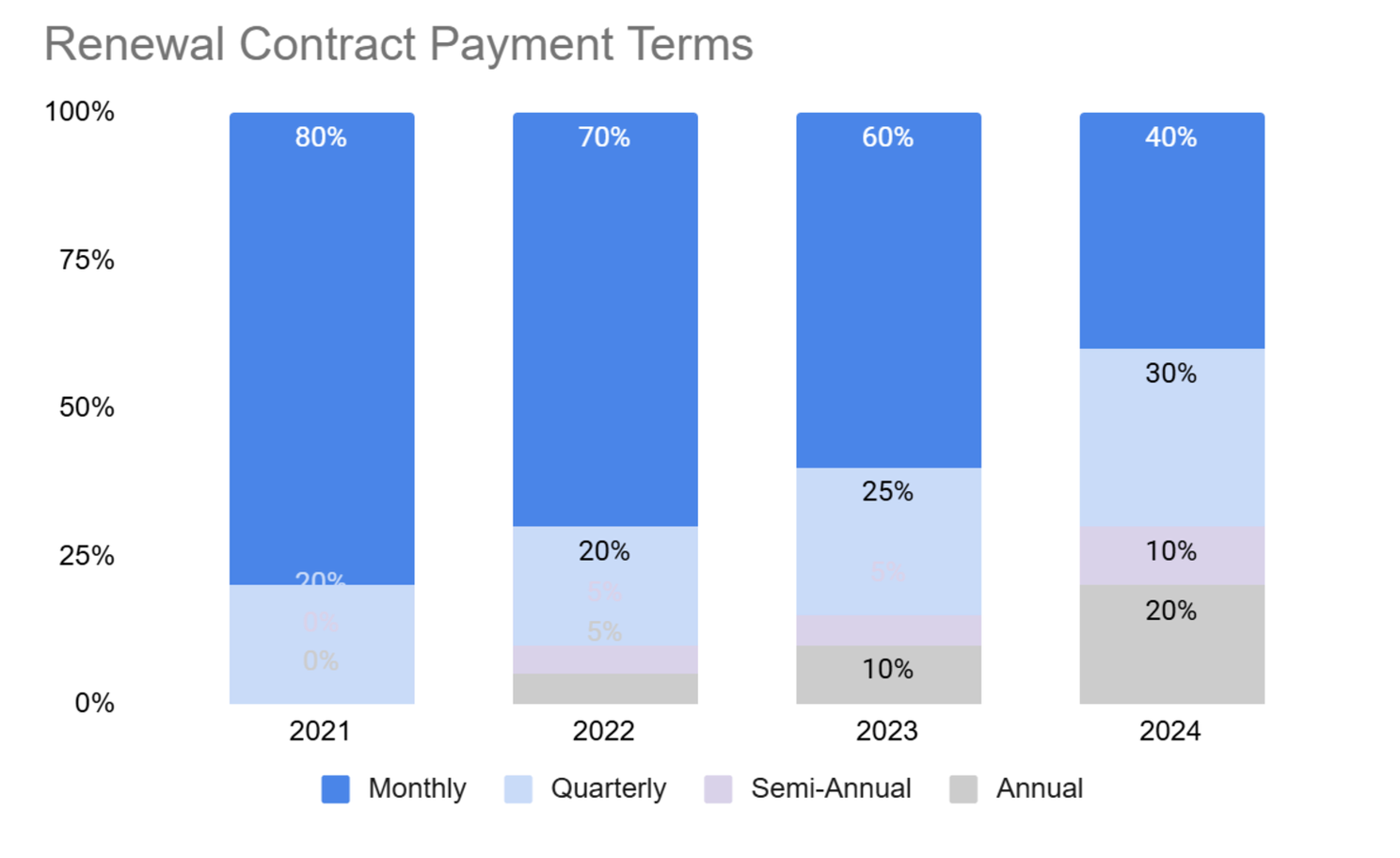
It is also useful to provide detail on some of the efforts underway to improve cash management. Two of my favorite visuals on that front are 1) days sales outstanding (DSO) and 2) contract payment terms, both of which signal how quickly you collect cash from your customers.
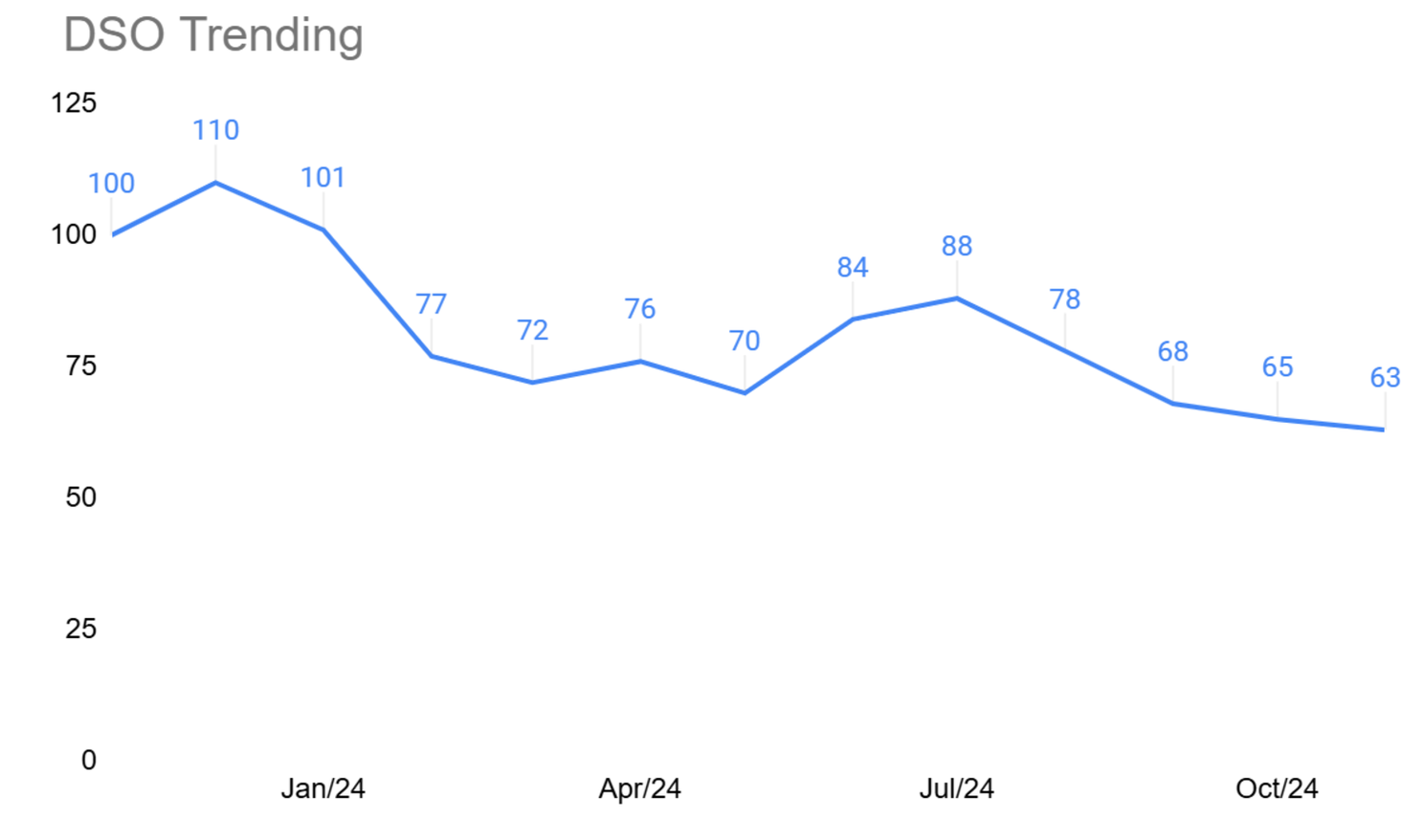
The chart above tracks month-over-month improvements in DSO. Company X has significantly improved their ability to collect cash from customer invoices faster, perhaps on account of launching automated invoice reminders or a similar tactic.
This next chart summarizes the company’s improvement in payment terms; the renewals team is doing good work to transition customers from monthly payment terms to more upfront payment options.
8. Include adoption and monetization data in Product/Eng updates
Neetu Rajpal, former CTO of Oscar Health and Conductor, recently joined a Primary event to speak about how to embrace C-Suite/GM thinking in product and engineering and boldly proclaimed, “it only matters if it can be sold!” Truer words have never been spoken.
While board members are certainly interested in learning about new product features and enhanced demos, none of that work matters if it does not yield adoption and revenue, so technical teams must include those details in board decks. A simple table like the one below is sufficient, and it’s important to supplement the numbers with qualitative context. In this example, the sales team is doing good work selling the predictions and advanced analytics products to new customers, but there is still an opportunity to do better with existing customers. The mobile app product may be new, which might explain why penetration is still low, but it would be helpful to articulate both a forward-looking target and gameplan for how the company will get there.

9. Provide perspective on the reliability and scalability of your platform
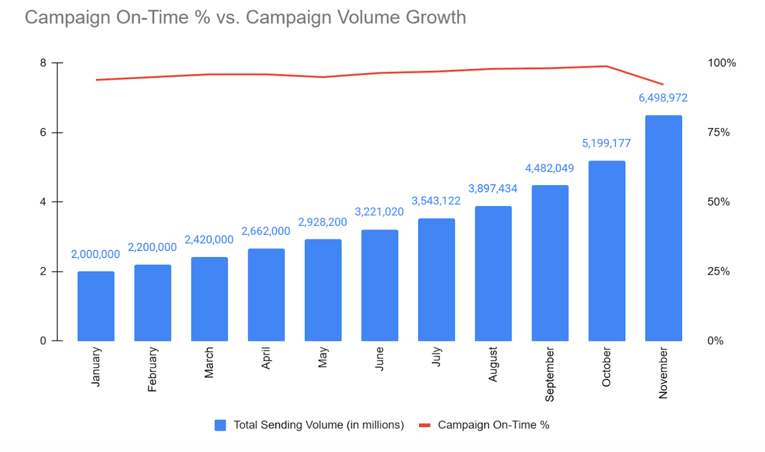
It’s equally important to comment on the reliability and scalability of your platform, as those are paramount to maintaining customer trust. A chart such as the one below contrasts a volume metric with a reliability metric; in this particular example, Company X had scaled reasonably well up until November, which requires some explanation. Perhaps this was a breaking news notifications company and the system was overwhelmed by Election Day news!
10. Present the state of the customer base with more sophistication than “traffic light” coding
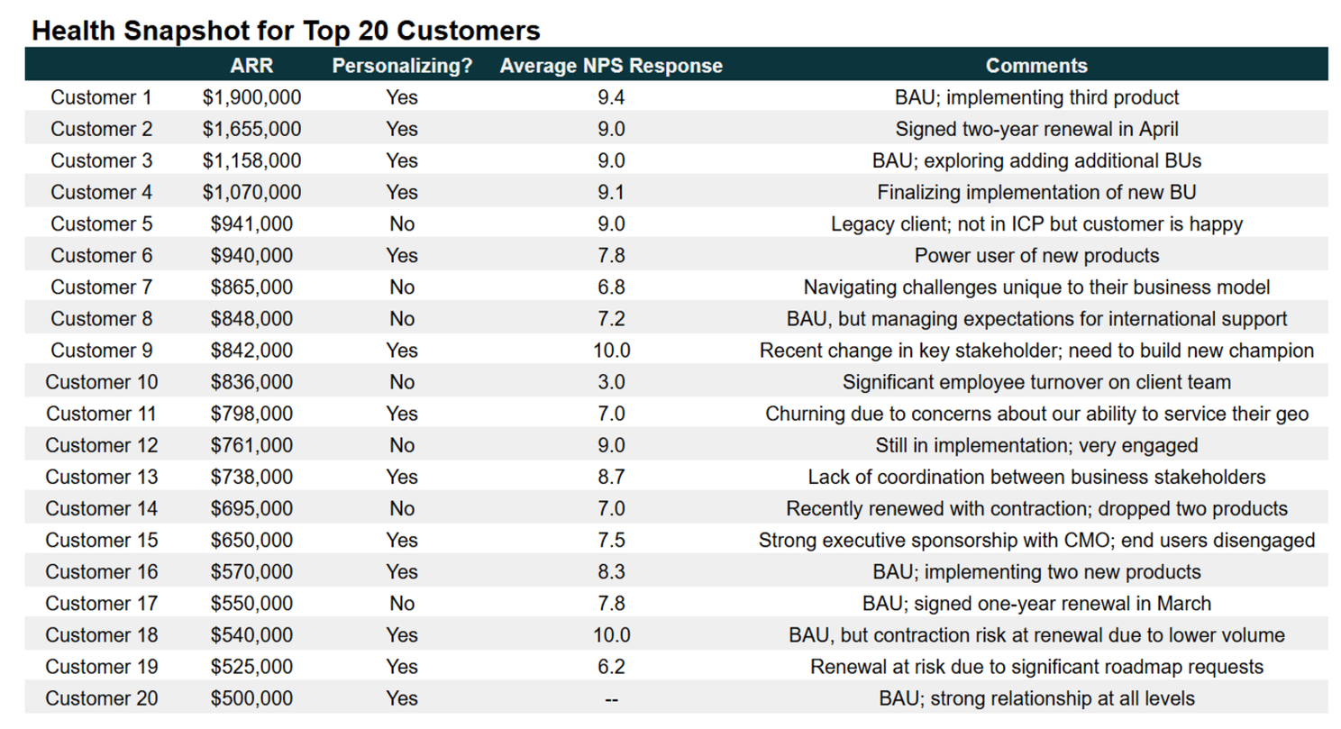
I’ve said it before and I’ll say it over and over again: if a company does everything in their power to make their customers successful (within their financial constraints, of course!), they would have to catastrophically screw something up not to succeed as a business–so a customer success and health snapshot is a critical ingredient in a compelling board update.
Customer health scoring merits its own Tactic Talkinstallment—a great idea for me to dive into in 2025—but the spoiler alert for board reporting is that summarizing CSM sentiment (a la red/yellow/green) is not going to impress anyone in the room. Customer health scores should reflect whatever the company has identified as their sticky drivers of net retention. In the redacted example below from my Sailthru days, we reported on personalization adoption because we knew that the net retention curve was significantly higher for customers that used that technology.
—
For general tips on how to improve your storytelling with data, make sure to revisit this earlier Tactic Talk edition outlining ten data upgrades and techniques to be more impactful.
And if you have your key metrics in hand and are curious how they stack up in the market, CJ Gustafson at Mostly Metrics recently compiled this excellent summary of an assortment of different SaaS benchmarking reports.
